Graphic design and illustration
Photo by Kelly Sikkema on Unsplash.
Over the course of (almost) two years, we’ve wrestled with an ever-evolving pandemic, an attempted insurrection, raging fires and an overall constant barrage of bleak outlooks for the future. The simulation really needs to chill.
This is where some blog posts would go into a narrative about compassion, hope, coping or the importance of self-help. Instead, we are going to talk about the rise of illustration within the world of design and branding and why that matters to consumers. That might sound insincere, but as advertisers, marketers, designers, etc., we wield a powerful tool that can impact people’s lives and moods. That’s a big responsibility.
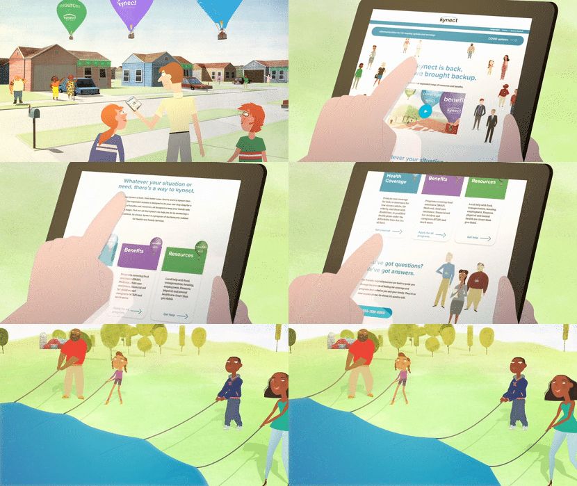
Prior to 2020, illustration had started becoming more and more closely associated with some major brand overhauls. Illustration and animation have always been associated with brands – MetLife and Snoopy, Butterfinger and Bart Simpson, Red Bull and the winged pencil-drawn characters, kynect and its wonderful watercolor world – and the notion of tying a specific style to a brand is nothing new. But what is currently happening is a complete elevation.

Perfectly imperfect
Instances of illustration in graphic design have typically been very simple. But in 2018, Chobani redesigned its entire brand system. Its previous look was very category-generic in the Greek yogurt space (or vanilla, if you will). What Chobani did was pretty radical – it incorporated beautiful, intricate illustration styles into its packaging and brand materials, which instantly injected a distinct personality. Chobani won a lot of recognition for that work, which inevitably meant designers (and brands) took notice.
This, to me, was a turning point. It reminded brands that illustration, with its beautiful imperfections and ability to be uniquely crafted, can be quite ownable as well as premium. What a dawning of a bright and beautiful new world, filled with vibrant color and positivity!
Enter 2020 (BTW see how well my predictions held up which design trends will not be following us into 2021).
With the pandemic taking hold, brands began to struggle a bit with their communications. One can only produce so many “unprecedented times” spots. The obvious solution was to look toward animation and illustration. This was a way to create fresh work without the worry of spreading a deadly disease on set. It also allowed brands to cast an entire world in which their products lived. A bright and hopeful world where people and products could truly flourish. As animation became more prevalent in TV spots, illustration in design became more dynamic. The illustrative trend truly accelerated. Such examples can be seen in COLLINS’ work for Robinhood and Alice Lee’s vibrant illustrations for Slack. These examples are particularly interesting given they are tech accounts. (Granted, COLLINS did a similar illustration-infused brand overhaul for Dropbox in 2017, so maybe it is to credit for guiding the space in that direction.)

Let's take having fun more seriously
Another unexpected trend surfaced in late 2020 and is still going solid in 2021 – the non-fungible token (NFT). It didn’t take long for brands to comb through their archives or partner with a hot illustrator to jump into the NFT space. Some brands, like Nike, have archives that are tailor-made for this arena. Others had to get more creative, crafting new expressions and pushing the boundaries of what one might consider brand illustration.
Suddenly brands seem unchained to any sort of assumption for how they come to life. Product photography can pair beautifully with whimsical characters. A complicated investment brand can tell its story in great detail using an illustration technique inspired by a Paul Pope graphic novel. A craft beer company can create simple characters to represent each beer variety. An educational tool can use soft, delicate animations to help users navigate. A THC startup can ….well the world of THC branding is another post altogether.
Illustration can help give your brand a distinct personality, filled with ownability and a feeling of premiumization. It speaks to the little imperfections in all of us and perhaps can even speak to the ever important need to gain consumer empathy. Illustration and animation are also just plain fun. We should all strive to make the world a little brighter and engaging. So, whether you prefer your illustration style to be nostalgic, abstract, flat or surreal, let’s all push to make the world more enjoyable. It’s our duty as creatives.
Liked what you read? Discover how Doe-Anderson Creative can bring your ideas to life.
)
)