How to build a brand identity
The importance
A brand visual identity is a way to communicate a brand’s positioning, offering and values in a visual manner. It allows a company to differentiate itself using brand identity elements that include logo, colors, typography and photography. Not only does visual differentiation create a sense of uniqueness to the product or service being offered, it makes the brand recognizable among its competitors.
While a visual identity is carefully developed, it must be used consistently, as it serves as the guide for the brand’s overall creative presence. For many consumers, these visual elements are the first interaction they have with a brand. From there on, they will draw on that interaction for how they associate with the brand’s offering.
The prep work
Prior to jumping into the visual identity design process, you must involve key stakeholders to clearly outline four factors that influence a brand’s success.
What is the brand’s purpose? Establishing its purpose can help inform short- and long-term objectives that can provide valuable insight into essential design aspects. This is where a brand’s mission, vision and values should be discussed.
Who is the target audience? If you don’t know your audience, you won’t know how to evoke emotion visually. Understanding them beyond general demographics is important. You must identify their wants, needs and fears to influence purchase intent.
What story do we want to tell? A brand’s story can help communicate its history and values, as well as the experiences it wishes to provide its consumer. As it pertains to the visual identity, the brand story can help inform specific elements such as color scheme and imagery.
Where will the brand visual identity show up? In order to start working on a brand identity, you must have some concept of where it will end up. Certain media platforms have very different demands from the consumer, but also from approaches to design. For instance, it’s unlikely a professional services client will need packaging design.

The visual branding process
Discovery
During this phase, stakeholders and agency team members will walk through the exercises below and draw out big conclusions that ends with a working brief.
Brand Assessment: Review brand identity materials from the past few years. This can include anything from advertising campaigns to collateral materials and web design. There should be discussion around what’s worked well and what’s felt disjointed or inconsistent.
Equity Exercise: This exercise helps prioritize current and past brand identity elements (i.e. color, logo, typeface). This helps inform which elements should be carried through or considered as part of the refreshed identity.
Brandscapes: Competitor and in-kind brands will be evaluated for their brand identity elements. This step is crucial for identifying areas for visual differentiation, but also allows the stakeholders to provide their visual preferences as they pertain on non-competitive brands.
Conversational Brief: This sets up the agency brief and establishes what exactly we want to achieve with this new look and feel. Following this exercise, we should have background and reasoning to inform an objective for the visual identity that’s about to be designed.
Development & definition
This is where the fun begins and a brand starts to visually come to life.
Internal Kick-off: Following a review of the Discovery phase, this internal briefing will ask creative team members to bring this brand to life visually without any final executions. Instead of traditional concept boards, they're asked to create moodboards. From here, the Creative Lead and Director of Design will be integral in overseeing the rest of the development process.
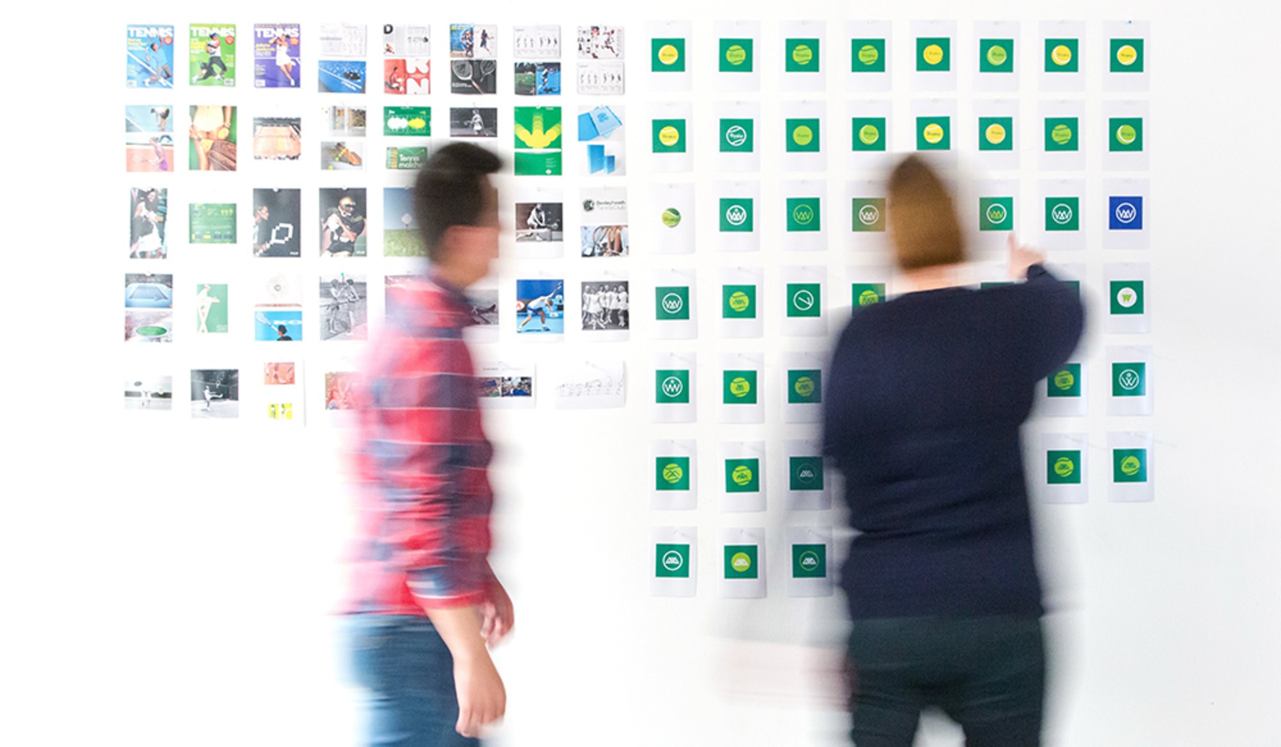
Moodboards: These are traditionally three pages and serve as a cohesive way to show brand elements working together. Each moodboard will have a page showing typeface, logo treatment and color palette, one to demonstrate photographic approaches and treatments, and a third that will give a sense of how all of those elements join together. Each creative team member will contribute moodboards that represent different visual identities.
Interactive Review: During this phase, all moodboards will be hung around a room. Similar to a guided tour of a museum, key stakeholders will be taken through each one, with the Creative Lead putting the visual identity into words. The stakeholders are then given color coded markers to physically stick on the creative elements, marking what they like, what they don't like, and what's intriguing. Afterward, the broader group will discuss what has been marked and why, as well as what has been given no notice. This exercise is very interactive and promotes collaboration in the development process. It should be more of a friendly, engaging conversation than a note-taking session.
Continued Development: Depending on client, timing, scale of the project and team dynamic, the Interactive Review can take place once or twice. Eventually, information gathered from the reviews will help cull down and curate the moodboards into one cohesive look that aligns with the brand's purpose, story and audience's needs discussed above.

Delivery
Visual Identity Guide: Once feedback final feedback is provided, brand assets will be delivered. These assets will be part of a visual identity guide to inform a master brand guide and future branded materials (i.e. print campaigns, website assets). This guide should include the following elements and their usage: Logo options, color palette, tone and personality, typeface, visual iconography, and photography style.
Liked what you read? Discover how Doe-Anderson Brand Strategy can help cultivate your brand.
)
)