Since the dawn of the Internet, you’ve essentially had two choices when arranging content for the web:
Basic, one-column layout
Time-consuming, complex, custom template
With this approach, pages that didn’t work within a one-column layout using a WYSIWYG editor would get their own custom templates with unique fields and logic. And that worked – sort of.
It was never ideal. You’d either have new pages that couldn’t work within a one-column layout, or you’d find your templates weren’t flexible enough down the road.
Then the module came.
Instead of putting all your text and images in one content area or a template which has predetermined text and image areas, modules let you add text and images to any page in blocks. They let you build (usually) time-consuming, complex web pages with ease. It’s LEGOs for the web.
“We’re not designing pages, we’re designing systems of components.” — Stephen Hay
A little history
This isn’t a new idea. I’ve been doing a form of this for a long time with others across the industry, but back in 2013, a smart guy named Brad Frost popularized the idea into a design system called Atomic Design. He even wrote a book named – you guessed it – Atomic Design. It’s a good read.
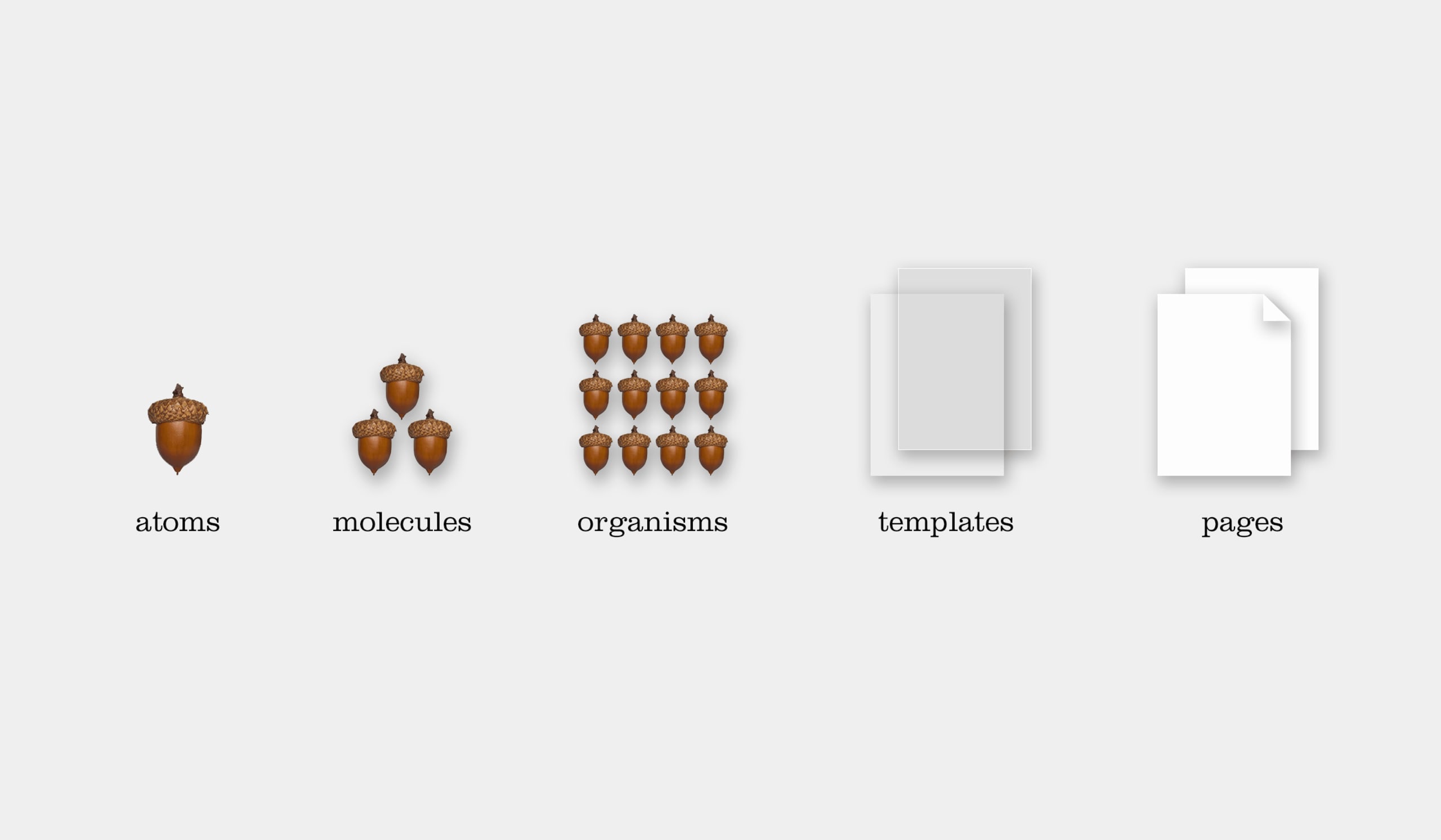
All matter begins with atoms.
Instead of designing templates, Atomic Design suggests starting with the smallest element – the atom. An atom is a logo, a typeface, a button. Together atoms make molecules. A search-form molecule could consist of a label atom, input atom and button atom. Now take your logo molecule, menu molecule and search-form molecule and you have a header organism. It’s simple – like chemistry.

Building blocks for web
Now implementing a new design system isn’t easy – especially at an agency as old as Doe-Anderson. Anything can turn into a multidepartmental effort. Even so, most of us have experience with the modular approach. We know it’s simpler to build, maintain and adapt websites. And it’s worked well for many large projects.
It’s clear to us – modules are better.
1. Modules are flexible
Modules can make an infinite number of different pages. They are reusable and flexible, making those complex, one-off pages simple.
Need a big image with text on top? That’s a module.
Need two columns of text? That’s a module.
Need a form? That’s a module.
Need a Google Map? That’s a module.
By placing these modules together, you make a contact page.
2. Modules can adapt
Templates solve a single problem. They offer rich user experiences designed around individual pages. Modules do that. But they let you expand those rich experiences beyond a single page.
There’s no set number of modules. You can have as few or as many as your website needs. None of it is set in stone. You can adjust or even add new modules. It doesn’t affect “legacy modules” – it adds to an ever-growing list that you can leverage at any time.
3. Modules are future-proof
Before modules, content managers had to work with a designer and developer to make a template for a reactive campaign. A template that quite possibly would never be used again. A modular approach lets you move quickly. You make a new page. Then add a headline module, text module and form module.
Publish and done.
4. Modules share a common language
Modules are a strong tool for communication. You can create an infinite number of different pages. But because you use the same modules, all these pages share the same common visual language.
This common language helps users better understand and navigate content. Once they’ve seen and interacted with a module in one place, they know how to use it – throughout the application.
Going forward
A modular approach lets us create websites that are simpler to build, maintain and adapt without sacrificing rich user experiences.
Modules fundamentally change how you design websites. We aren’t designing pages. Instead we are designing a system of components. Together they make an infinite number of possibilities.
With modules, you aren’t limited by templates. You are only limited by your own creativity.
)
)